
Building a concert countdown website with AI
Overview
What happens when a UX designer, a rainy Sunday, an SNL episide, and an AI collide? You get KATTDOtimer.fun — a fully custom, accessible, interaction-rich concert countdown webpage for Harry Styles’ 2026 Madison Square Garden residency.
This case study documents how I partnered with Claude (Anthropic’s AI assistant) to design and build a polished, production-quality web experience from scratch — in a single conversation, in a single day. It’s a story about creative direction, UX craft, iteration, and what it really means to co-create with AI.
1. The Spark: A Sunday Project
It started the way the best side projects do — completely unplanned.
I was watching SNL on a Sunday morning, and the episode happened to feature Harry Styles as the musical guest. My friend and I already have tickets to see him at Madison Square Garden in late October 2026, and sitting there watching him perform, a thought struck me:
“What if I made a concert countdown webpage for his North American residency?”
It felt like the perfect Sunday project. I’ve been deliberately pushing my AI skills, using Claude as a creative and technical collaborator on increasingly complex work. A countdown site was scoped just right — meaningful enough to be interesting, contained enough to finish in a day.
I opened Claude, described what I had in mind, and we were off.
2. Designing Together: The Evolution
What followed was a genuine back-and-forth design process — not just prompting an AI to generate code, but acting as creative director, UX lead, and QA all at once, while Claude handled implementation. Here’s how the key pillars evolved.
2a. Content Hierarchy — Getting the Structure Right
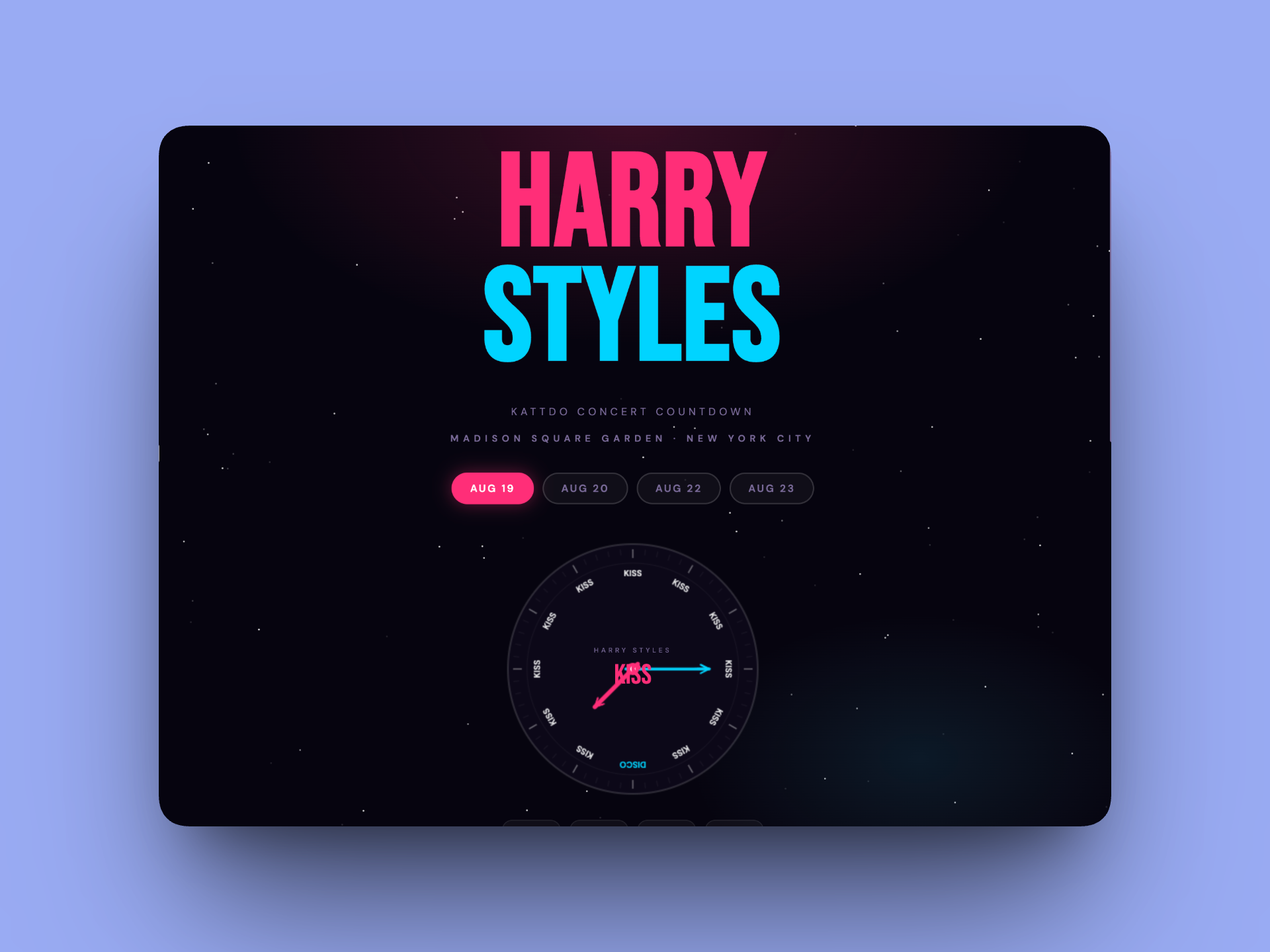
My first instinct was to show the date chips and a clock face inspired by the official Harry Styles marketing clock (which replaces hour numbers with the word “KISS” and one position with “DISCO”). We built an initial version with four date pill buttons and an animated clock.
But as the project grew, hierarchy became a real conversation. I kept pushing on what the page was “really” about: your date, your countdown, your excitement. We went through several rounds of adjustment:
Moving "KATTDO Concert Countdown" above "Madison Square Garden" (then swapping them back)
Adjusting vertical spacing between the title, subtitle, and venue text precisely to 16px and 8px
Making Harry Styles one line instead of two (to reclaim vertical real estate for the wheel)
Moving instructional hint text below the wheel, not above it
Every spacing decision was intentional — and I caught when Claude’s "16px" actually rendered as 72px because of stacked padding from multiple elements. Specificity mattered.
The first iteration of my prompt pulled together the most baseline visual
2b. Desktop and Mobile — Responsive by Default
From the very first build, Claude was already accounting for mobile — using clamp() for fluid font sizes, responsive flex layouts, and media query breakpoints for the wheel size and countdown blocks.
When I noted that the countdown blocks felt small on desktop, we introduced a clamp(44px, 6vw, 64px) scaling approach that made them feel substantial on large screens while staying compact on mobile. The wheel itself scales from 400px on desktop down to 320px on smaller screens.
The custom cursor (a pink ring that grows on click) was a deliberate desktop flourish — the kind of detail that makes the experience feel designed, not generated.
The default build always had centered the sizing of the content to fit within mobile.
2c. Alignment with the Harry Styles Universe — Inspired, Not Copied
This was one of the most interesting design tensions in the project. The official marketing for the tour uses a clock face where every hour position reads “KISS” except one that reads “DISCO” — a striking, memorable motif.
I wanted to honor that energy without reproducing it. My approach:
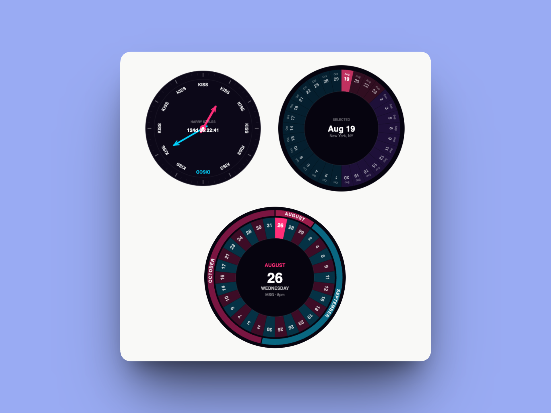
The clock face with KISS/DISCO words was included early but evolved — eventually replaced entirely by the date wheel
The pink (#FF2D78) and cyan (#00D4FF) color palette nods to the tour’s aesthetic without lifting it directly
KISS and DISCO became the game mechanic of the disco ball — conceptually tied to the tour but expressed through an original interaction
The branding uses “KATTDO” (not “Together, Together”) deliberately, on legal advice, to avoid trademark issues Note from Sophia - I actually chose to remove this all together.
We also had a genuine conversation about copyright and right of publicity — landing on keeping the non-affiliation disclaimer prominent and avoiding any registered marks.
There were many conversations about accessibility, structure, and interactions to get to the final.
2d. Interaction Design — Making it Fun
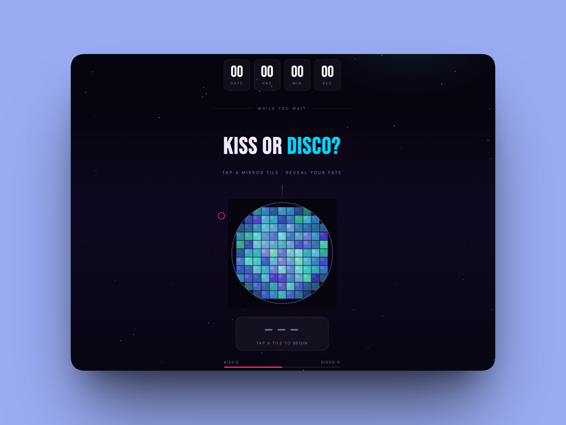
This is where the project really came alive. Early in the conversation, I shared a reference image of a disco ball and asked: what if the game lived inside a disco ball, where each mirror tile hides KISS or DISCO?
Claude built a full canvas-based animated disco ball with:
Sphere lighting simulation (nz normals for 3D shading on each tile)
Shimmer animation via per-tile sin wave phases
Specular highlight gradient overlay
Pulse ring animation on tile reveal (pink for KISS, cyan for DISCO)
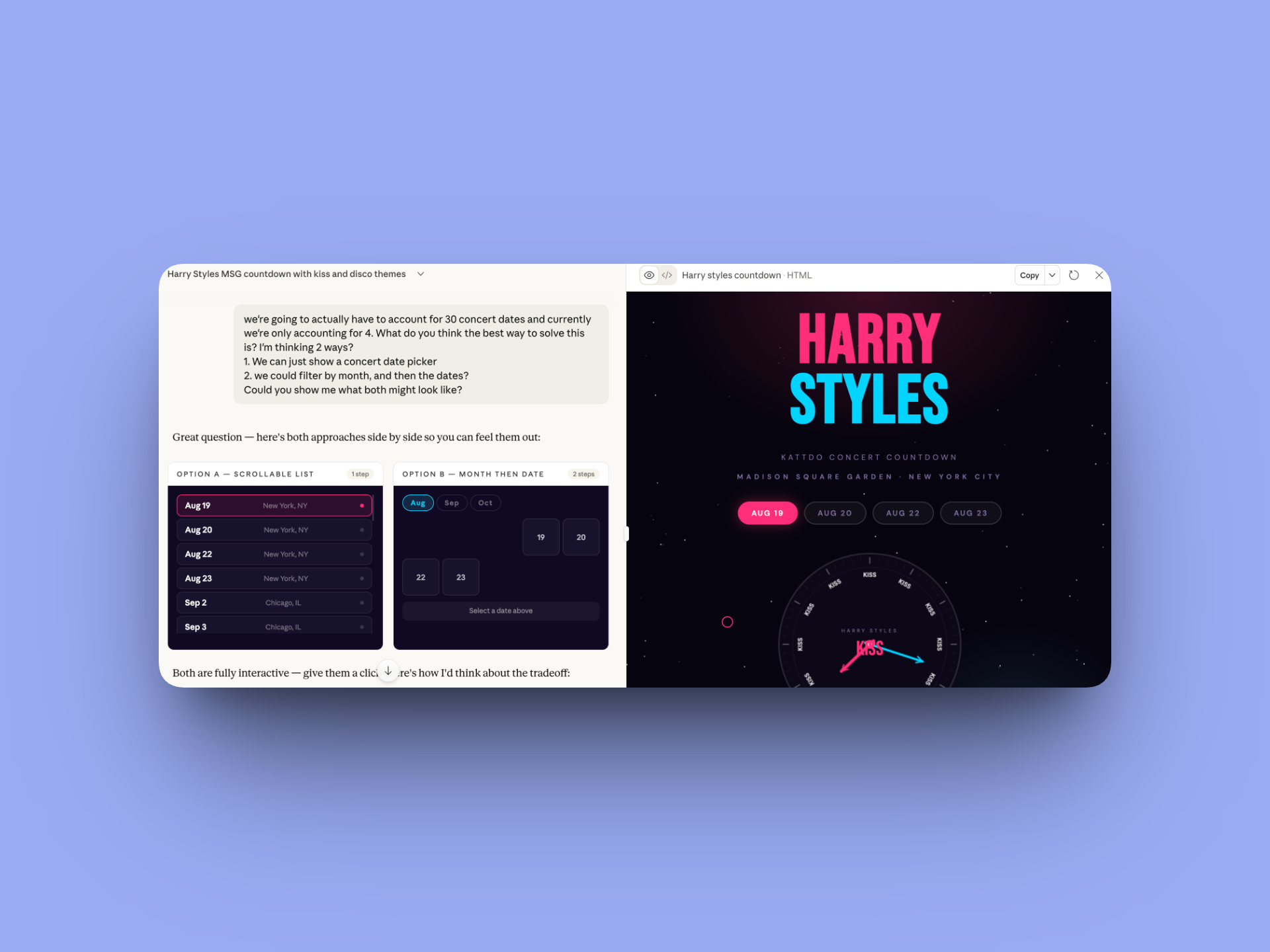
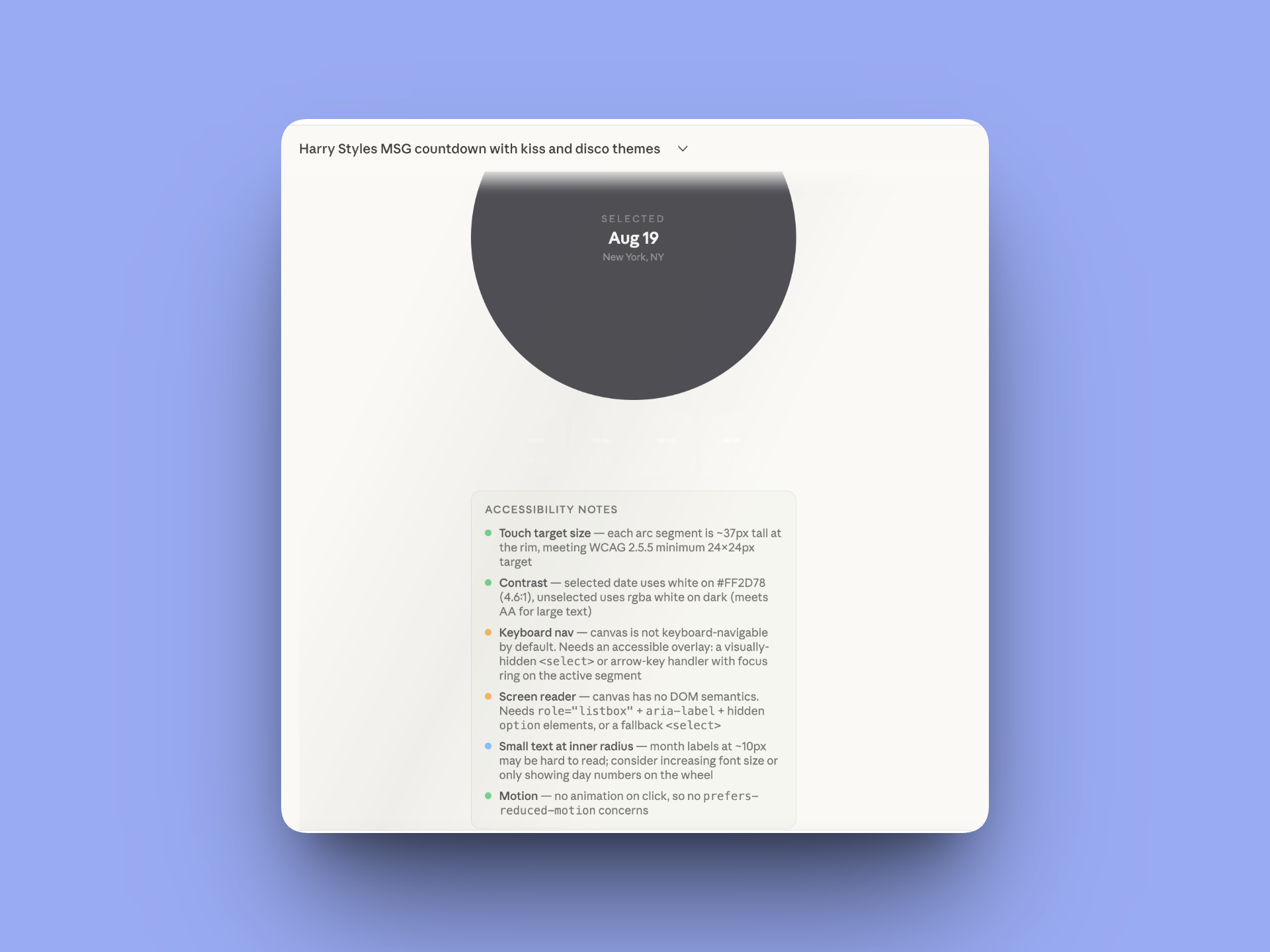
The date picker went through the most dramatic evolution. We prototyped three concepts in an interactive mockup:
Option A: A scrollable pill list of all 30 dates
Option B: Month tabs filtering to a date grid
Option C (what we built): A 30-segment wheel where each slice is a date
The wheel replaced the clock face entirely — it became both the date picker AND the hero visual. We added an outer month band (AUGUST / SEPTEMBER / OCTOBER) with curved text following the arc of each month’s section.
The kiss mark animation required the most iteration. I wanted lipstick stamps to rain down on KISS reveals — but my first attempts produced shapes that looked nothing like lips. We went through 10+ SVG path iterations, with me directing each tweak (“make the bottom lip dip more dramatic,” “more like two rounded triangles,” “there should be a gap between the lips”) until landing on a shape I was happy with. Note from Sophia - This is hilarious to me
As you can see, I chose an entirely different direction in the end.
2e. Sharing — Extending the Experience
A countdown is more fun when shared. We added three sharing mechanisms below the countdown blocks:
Copy link — generates a URL with ?date=N so anyone who opens it lands on the right date
Add to calendar — generates a .ics file for Apple Calendar, Google Calendar, and Outlook
Share with friends — uses the Web Share API to open the native mobile share sheet (WhatsApp, iMessage, Instagram etc.), with a clipboard fallback on desktop
One of my initial selections was an “email myself” option using EmailJS. But I caught my own mistake and corrected it — I actually wanted the native share sheet. We swapped it out, removing the EmailJS SDK, modal, and all related JS cleanly.
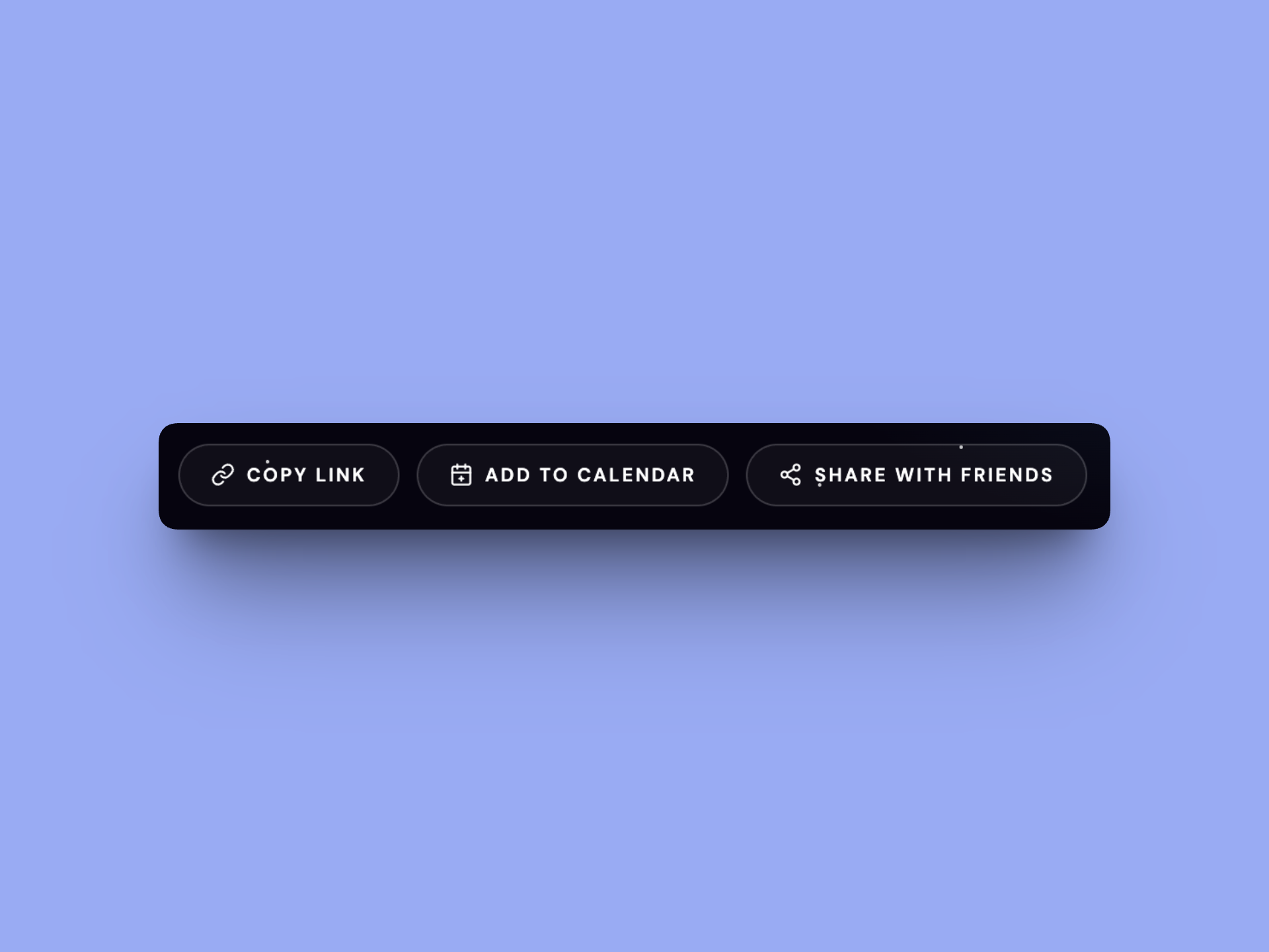
The most baseline element, but this was extremely important to me. I actually used Cursor to ensure share with friends was working correctly on release.
2f. Accessibility — Not an Afterthought
Accessibility was woven into the project from the moment we introduced the wheel. I raised the concern directly: a canvas element has no DOM semantics. How do keyboard and screen reader users interact with it?
Claude proposed the visually-hidden <select> pattern — a real form element clipped to 1×1px (in tab order, announced by screen readers) that drives the wheel when changed. We went through two iterations of this:
First attempt used opacity: 0 with full width/height — this blocked mouse clicks on the canvas
Final implementation uses clip: rect(0,0,0,0) + 1px dimensions — invisible, non-blocking, fully accessible
Other accessibility work included:
aria-live="polite" on the countdown display
aria-live="assertive" on a hidden div that announces KISS/DISCO results for the disco game
A real <button> element ("Reveal a tile") so the game is fully keyboard-playable
All text upgraded to white on dark backgrounds (contrast ratio 18:1, well above WCAG AA 4.5:1)
Minimum 12px font sizes, with bold weight at smaller sizes
I also challenged Claude directly when it said the month text in the wheel was accessible — 7px rotated text inside a narrow arc slice cannot pass WCAG regardless of color. The fix was to remove month labels from the slices entirely and move them to the outer band and the readable center display.
This is just one of many deep dives into accessibility Claude and I had.
3. The End Result — and What’s Next
The final site is a single HTML file — no frameworks, no build tools, no dependencies except Google Fonts. Everything is custom-coded: the wheel, the disco ball, the animations, the kiss mark SVGs, the .ics generator, the share sheet.
Key final features:
Animated 30-date wheel with outer month band and curved arc text
Live countdown updating every second
Retina-sharp canvas rendering (devicePixelRatio scaling on both canvases)
Disco ball game with KISS/DISCO tile reveals, pulse animations, kiss mark rain
Share row: copy link, .ics calendar download, native share sheet
Full accessibility: keyboard nav, screen reader support, WCAG AA contrast
Custom cursor, twinkling starfield, concert overlay on countdown completion
Footer: © 2026 MixedMediaSophia
Recreating in Cursor and Hosting on GitHub
The final step of the project was preparing it for a real production environment. I asked Claude to generate a comprehensive Cursor project outline — a detailed .txt file covering the design system, every section’s specs, accessibility requirements, all 30 tour dates, and legal notes.
The plan for taking this to production:
Open the project outline in Cursor (an AI-powered code editor)
Use the outline + the existing HTML file as the source of truth to rebuild with clean, maintainable code
Host on GitHub Pages for free, zero-infrastructure deployment
Optionally connect a custom domain (e.g. kattdotimer.fun)
The outline I exported covers everything a developer — or AI pair programmer — would need to recreate the project faithfully without any of our conversation context.
4. Reflection: What This Project Taught Me
Working with Claude on this project wasn’t like using a code generator. It was more like working with a very fast, very capable junior developer who needed creative direction, quality review, and occasional course-correction.
A few things stood out:
Creative direction is still the hard part
Claude could build whatever I described. The hard work was knowing what to describe — and being specific enough that the output matched the vision. The kiss mark iteration is a perfect example: 10+ rounds of SVG path adjustments, each guided by a specific visual note from me.
Catching errors is a skill
I caught a 16px spacing that was actually rendering as 72px (stacked padding from three sources). I caught a visually-hidden select that was blocking mouse clicks. I caught the email option being included when I’d actually selected native share. Knowing enough to spot when something is wrong — even if you couldn’t write the fix yourself — is genuinely valuable.
Accessibility requires advocacy
Left to default behavior, the wheel would have been completely inaccessible. I had to raise the concern, evaluate the proposed solutions, and push back when a fix wasn’t sufficient. AI doesn’t automatically build accessibly — designers have to demand it.
One conversation, one afternoon, one real product
The thing I find most remarkable: this entire project — ideation, design, iteration, debugging, accessibility, legal considerations, documentation — happened in a single Claude conversation over the course of one Sunday afternoon. That’s a genuinely new way to work.
If you made it this far - thanks! I didn’t write this post. I used Claude to generate this case study because it was my closest partner on this work, and it could speak to developmental pieces I personally could not. I was happy with the outcome, so I decided to share it! You may have noticed I added a few notes in areas that were not quite accurate, or where I was surprised Claude brought that point up.
As we keep moving into a future with AI, I wanted to be transparent about the process!
If you’re interested in learning more or working together, please reach out! I’d be happy to chat further.Sophia
Sophia — MixedMediaSophia
© 2026 MixedMediaSophia. All rights reserved.